Guide to Reading Letter Transcriptions
Some of these features are only visible when "plain text" is off.
| Textual Feature | Appearance |
|---|---|
| passage deleted with a strikethrough mark | |
| passage deleted by overwritten added letters | |
| passage added above the line | passage with added text above |
| passage added on the line | passage with added text inline |
| passage added in the margin | passage with text added in margin |
| handwritten addition to a typewritten letter | typed passage with added handwritten text |
| missing or unreadable text | missing text noted with "[illegible]" |
| uncertain transcriptions | word[?] |
| notes written by someone other than Willa Cather | Note in another's hand |
| printed letterhead text | printed text |
| text printed on postcards, envelopes, etc. | printed text |
| text of date and place stamps | stamped text |
| passage written by Cather on separate enclosure. | written text |
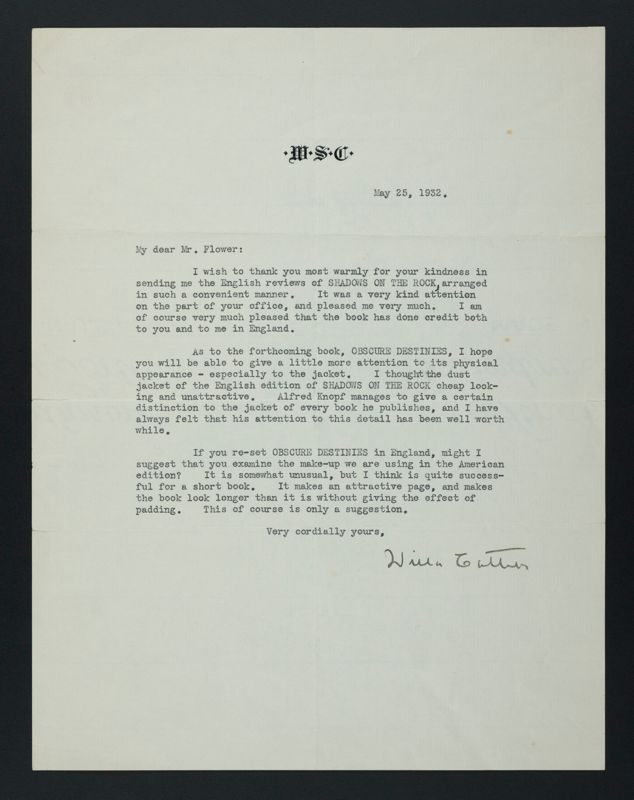
I wish to thank you most warmly for your kindness in sending me the English reviews of SHADOWS ON THE ROCK3, arranged in such a convenient manner4. It was a very kind attention on the part of your office, and pleased me very much. I am of course very much pleased that the book has done credit both to you and to me in England5.
As to the forthcoming book, OBSCURE DESTINIES6, I hope you will be able to give a little more attention to its physical appearance - especially to the jacket. I thought the dust jacket of the English edition of SHADOWS ON THE ROCK cheap looking and unattractive. Alfred Knopf7 manages to give a certain distinction to the jacket of every book he publishes, and I have always felt that his attention to this detail has been well worth while.
If you re-set OBSCURE DESTINIES in England, might I suggest that you examine the make-up we are using in the American edition? It is somewhat unusual, but I think is quite successful for a short book. It makes an attractive page, and makes the book look longer than it is without giving the effect of padding. This of course is only a suggestion.
Very cordially yours, Willa CatherInformation about this letter:
- Source File:
- cat.let1110.xml
- Letter identifier
- 1110
- Contents
- Document is one leaf, typewritten on recto only.
- Person to whom letter was written
- Walter Newman Flower 1
- Date letter was written
- May 25, 1932
- Place letter was written
- New York, New York, United States2
- Location of original letter
- Willa Cather Papers, 1899-1949, in the CLifton Waller Barrett Library (#6494-6494-i), University of Virginia, Special Collections, Charlottesville, VA
Individual Annotations
Cassell's created a small pamphlet and pasted clipped reviews into it. Cather liked this arrangement so much that she and Edith Lewis created similar small scrapbooks to collect reviews of other Cather books.
Person Annotations
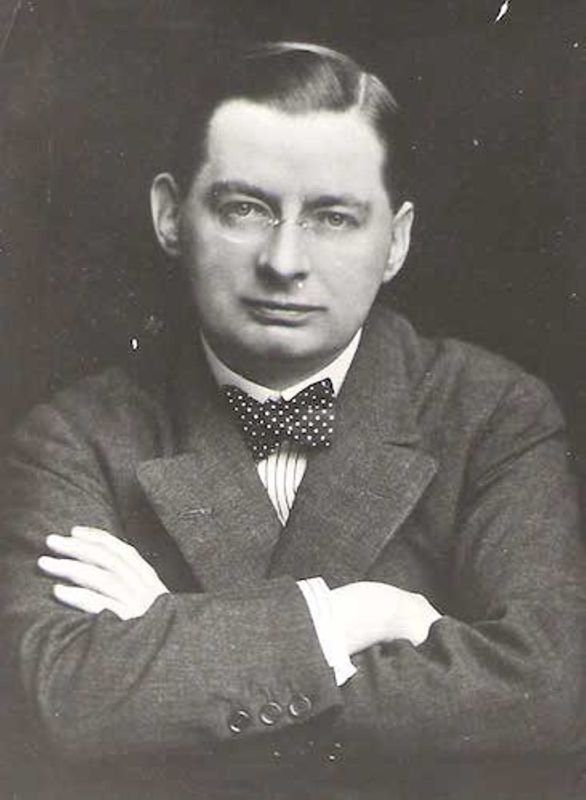 Flower, Walter Newman (1879-1954). British publisher and writer.
Newman Flower, as he was usually known, was born and educated in
Dorset, England. He began working in publishing when he was seventeen and
joined the British publisher Cassell in 1906. He took charge of its book
publishing division in 1912 and bought the company in 1927. Cather
corresponded with Flower after Cassell began publishing the British editions
of her books in 1932; the company also took over The Song
of the Lark from the earlier British publishers, John Murray and
Jonathan Cape.
Flower, Walter Newman (1879-1954). British publisher and writer.
Newman Flower, as he was usually known, was born and educated in
Dorset, England. He began working in publishing when he was seventeen and
joined the British publisher Cassell in 1906. He took charge of its book
publishing division in 1912 and bought the company in 1927. Cather
corresponded with Flower after Cassell began publishing the British editions
of her books in 1932; the company also took over The Song
of the Lark from the earlier British publishers, John Murray and
Jonathan Cape.
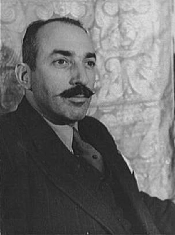 Knopf, Alfred A. (1892-1984). President of New York
publisher Alfred A. Knopf, Inc. Knopf received his BA from
Columbia University in New York City in 1912 and founded Alfred Knopf, Inc.,
in 1915 with his future wife Blanche Wolf. They married in 1916, and their
son Alfred “Pat” Knopf was born in 1918. Cather chose him as her publisher
beginning with Youth and the Bright Medusa (1920) and
One of Ours (1922), partly because she was
dissatisfied with the promotion of her books by Houghton Mifflin but also
because she recognized the high quality of Knopf's books, as well as what
she regarded as his intelligent advertising. Knopf was noted for publishing
the work of leading European and South American writers in translation, as
well as original works. Knopf and Cather’s extensive correspondence
testifies to their mutual professional respect and to what also became an
important personal friendship.
Knopf, Alfred A. (1892-1984). President of New York
publisher Alfred A. Knopf, Inc. Knopf received his BA from
Columbia University in New York City in 1912 and founded Alfred Knopf, Inc.,
in 1915 with his future wife Blanche Wolf. They married in 1916, and their
son Alfred “Pat” Knopf was born in 1918. Cather chose him as her publisher
beginning with Youth and the Bright Medusa (1920) and
One of Ours (1922), partly because she was
dissatisfied with the promotion of her books by Houghton Mifflin but also
because she recognized the high quality of Knopf's books, as well as what
she regarded as his intelligent advertising. Knopf was noted for publishing
the work of leading European and South American writers in translation, as
well as original works. Knopf and Cather’s extensive correspondence
testifies to their mutual professional respect and to what also became an
important personal friendship.
Place Annotations
Work Annotations
Shadows on the Rock (1931), by Willa Cather
Obscure Destinies (1932), by Willa Cather
